


Before getting into Google Charts and examples it is good to know what are charts and how it is useful.
“A picture is worth a thousand words” means that a complex things/idea can be conveyed easily with just a single still picture. Charts can also be used in same way, where it can help conveying information with just one box where it can take pages to describe with text and numbers.
What is chart?
A chart of graph is graphical representation of data and nothing else. Think of when you’re presenting and explaining data. You can show tables with figures, numbers, percentages and relationships. However, the chances are that your point will be lost if you rely on these alone.
But if you use a chart or a graph then all thing will make sense suddenly because charts itself can describe the information in easier manner. It helps understanding the data easily and quickly.
Deciding to show information using chart is also not enough, as there are many kind of charts/graphs available. You also have to decide what kind of chart will be suitable for the information you like to share with your audience/peoples. Few common charts are:
- Area chart
- Bar chart
- Bubble chart
- Pie chart
- Column chart
- Line chart
- Diff chart
- Table chart
Google Charts
It provides easier way to visualize information on your website using their services. Google is providing wide range of charts starting from simple line charts to complex tree maps. If you are working on analytics project and you like to show big information/data using rich chart system then Google charts is the best option. Google charts is a powerful chart tools yet very easy to implement.
Here is the list of common charts with details on how to integrate using their JavaScript API.
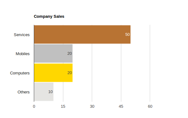
1. Bar Chart (See bar chart on Google Charts)
function drawBarChart() {
var data = google.visualization.arrayToDataTable([
['Source', 'Percentage', {role: 'style'}],
['Services', 50, '#b87333'], // RGB value
['Mobiles', 20, 'silver'], // English color name
['Computers', 20, 'gold'],
['Others', 10, 'color: #e5e4e2'], // CSS-style declaration
]);

var view = new google.visualization.DataView(data);
view.setColumns([0, 1,
{calc: "stringify",
sourceColumn: 1,
type: "string",
role: "annotation"},
2]);

var options = {
title: "Company Sales",
width: 600,
height: 400,
bar: {groupWidth: "95%"},
legend: {position: "none"},
};
var chart = new google.visualization.BarChart(
document.getElementById("bar_chart_div"));
chart.draw(view, options);
}
2. Pie Chart (See pie chart on Google Charts)

function drawPieChart() {

// Create the data table.
var data = new google.visualization.DataTable();
data.addColumn('string', 'Source');
data.addColumn('number', 'Percentage');
data.addRows([
['Services', 50],
['Mobiles', 20],
['Computers', 20],
['Others', 10],
]);

// Set chart options
var options = {'title': 'Company Sales',
'width': 400,
'height': 300};

// Instantiate and draw our chart, passing in some options.
var chart = new google.visualization.PieChart(
document.getElementById('pie_chart_div'));
chart.draw(data, options);
}
3. Column Chart (See column chart on Google Charts)

function drawColumnChart() {

var data = google.visualization.arrayToDataTable([
['Source', 'Percentage', {role: 'style'}],
['Services', 50, '#b87333'], // RGB value
['Mobiles', 20, 'silver'], // English color name
['Computers', 20, 'gold'],
['Others', 10, 'color: #e5e4e2'], // CSS-style declaration
]);

var view = new google.visualization.DataView(data);
view.setColumns([0, 1,
{calc: "stringify",
sourceColumn: 1,
type: "string",
role: "annotation"},
2]);

var options = {
title: "Company Sales",
width: 600,
height: 400,
bar: {groupWidth: "95%"},
legend: {position: "none"},
};
var chart = new google.visualization.ColumnChart(
document.getElementById("column_chart_div"));
chart.draw(view, options);
}
4. Line Chart (See line chart on Google Charts)

function drawLineChart() {

var data = google.visualization.arrayToDataTable([
['Year', 'Sales', 'Expenses'],
['2004', 1000, 400],
['2005', 1170, 460],
['2006', 660, 1120],
['2007', 1030, 540]
]);

var options = {
width: 600,
height: 400,
title: 'Company Performance',
curveType: 'function',
legend: {position: 'bottom'}
};

var chart = new google.visualization.LineChart(
document.getElementById('line_chart_div'));

chart.draw(data, options);

}
5. Bubble Chart (See bubble chart on Google Charts)

function drawBubbleChart() {
var data = google.visualization.arrayToDataTable([
['ID', 'X', 'Y', 'Temperature'],
['', 80, 167, 120],
['', 79, 136, 130],
['', 78, 184, 50],
['', 72, 278, 230],
['', 81, 200, 210],
['', 72, 170, 100],
['', 68, 477, 80]
]);

var options = {
title: 'Temperature Bubble Chart',
width: 600,
height: 400,
colorAxis: {colors: ['yellow', 'red']}
};

var chart = new google.visualization.BubbleChart(
document.getElementById('bubble_chart_div'));
chart.draw(data, options);
}
6. Donut Chart (See donut chart on Google Charts)

function drawDonutChart() {

var data = new google.visualization.DataTable();
data.addColumn('string', 'Source');
data.addColumn('number', 'Percentage');
data.addRows([
['Services', 50],
['Mobiles', 20],
['Computers', 20],
['Others', 10],
]);

var options = {'title': 'Company Sales',
'width': 400,
'height': 300,
pieHole: 0.4,
};

var chart = new google.visualization.PieChart(
document.getElementById('donut_chart_div'));
chart.draw(data, options);
}
7. Table Chart (See table chart on Google Charts)

function drawTable() {
var data = new google.visualization.DataTable();
data.addColumn('string', 'Source');
data.addColumn('number', 'Percentage');
data.addColumn('string', 'Year');
data.addRows([
['Services', {v: 50, f: '50%'}, '2015'],
['Mobiles', {v: 20, f: '20%'}, '2015'],
['Computers', {v: 20, f: '20%'}, '2015'],
['Others', {v: 10, f: '10%'}, '2015'],
['Services', {v: 40, f: '40%'}, '2014'],
['Mobiles', {v: 30, f: '30%'}, '2014'],
['Computers', {v: 10, f: '10%'}, '2014'],
['Others', {v: 20, f: '20%'}, '2014'],
]);

var table = new google.visualization.Table(
document.getElementById('table_chart_div'));

table.draw(data, {showRowNumber: true, width: '50%', height: '50%'});
}
8. Candlestick – Waterfall Chart (See waterfall chart on Google Charts)

function drawCandlestickChart() {
var data = google.visualization.arrayToDataTable([
['Mon', 28, 28, 38, 38],
['Tue', 38, 38, 55, 55],
['Wed', 55, 55, 77, 77],
['Thu', 77, 77, 66, 66],
['Fri', 66, 66, 22, 22]
], true);

var options = {
legend: 'none',
'width': 400,
'height': 300,
bar: {groupWidth: '100%'}, // Remove space between bars.
candlestick: {
fallingColor: {strokeWidth: 0, fill: '#a52714'}, // red
risingColor: {strokeWidth: 0, fill: '#0f9d58'} // green
}
};

var chart = new google.visualization.CandlestickChart(
document.getElementById('candlestick_chart_div'));
chart.draw(data, options);
}
9. Histogram Chart (See histogram chart on Google Charts)

function drawHistogramChart() {
var data = google.visualization.arrayToDataTable([
['Source', 'Percentage'],
['Computers', 15],
['Mobiles', 5],
['Services', 25],
['Call Centers', 35],
['Market', 5],
['Advertisements', 5],
['Others', 10],
]);

var options = {
title: 'Company Sales',
'width': 400,
'height': 300,
legend: {position: 'none'},
};

var chart = new google.visualization.Histogram(
document.getElementById('histogram_chart_div'));
chart.draw(data, options);
}
10. WordTree Chart (See wordtree chart on Google Charts)

WordTree view with Weight

function drawWordTree() {
var data = google.visualization.arrayToDataTable(
[['Phrases'],
['JavaScript is language'],
['JavaScript is scripting language'],
['JavaScript is popular'],
['JavaScript is client side scripting language'],
['JavaScript is base of jQuery'],
['JavaScript is base of Prototype'],
['JavaScript is base of Angular'],
['JavaScript is base of Backbone'],
]
);

var options = {
wordtree: {
format: 'implicit',
word: 'JavaScript'
}
};

var chart = new google.visualization.WordTree(
document.getElementById('wordtree_chart_div'));
chart.draw(data, options);
}
Download complete source code for the charts shown above: Download Source
I’ve also wrote one WordPress plugin using many of these charts. It is simple WordPress plugin that embeds charts in your blog and shows the usage and numbers related to blog, category, page, comment, tag, user and CPT. This plugin allow you to see how your blog is using all these elements. All the stats shown using Google Chats including Pie Chart, Google Column Charts and Google Table.
Plugin URL: WP Show Stats – Personal dashboard for WordPress admin
More information: WP Show Stats – Features and how to use guide
There are plenty of other charts as well which can be used according to different requirements. Here is the list of useful links for other demos and documentation for Google Charts.
Useful links for Google Charts
Charts: https://developers.google.com/chart/
Demos: https://developers.google.com/chart/interactive/docs/gallery
Google charts Development API reference: https://developers.google.com/chart/interactive/docs/reference
Charts Forum: https://groups.google.com/forum/#!forum/google-visualization-api
Please add comment or drop me an email if you need any kind of help or having trouble in implementing charts.

